


The power of typography: Nokia case study
Typography has a rich history spanning centuries, with every era and culture leaving its mark on this art form. The evolution of typography is not only a reflection of the cultural and artistic movements of the time, but also an affirmation of modernity. From the earliest manuscripts to digital typography, typography has a significant impact on design and communication.
Typography, as the result of a mechanical system, dates back to the mid-15th century with Johannes Gutenberg’s invention. The first printed books were produced using this new technology, and typography quickly became an integral part of book design and society. Early typography was heavily influenced by handwriting, with serif typefaces predominating. As typography evolved, the need for more legible typefaces led to the development of new sans-serif typefaces.
Throughout the 20th century, typography continued to evolve as new cultural movements emerged. The Art Nouveau movement introduced us to decorative and ornamental typefaces, whilst the Bauhaus movement emphasised simplicity and functionality in design. The digital age has ushered in a new era of typography, with the development of digital fonts and the ability to create custom typefaces quickly and easily.
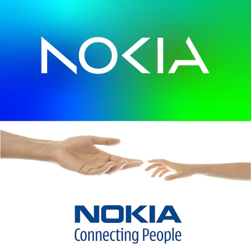
Nokia’s current typography and the evolution of its branding
Today, typography remains a statement of modernity, with the creation of new typefaces that reflect current cultural and design trends. Minimalism has paved the way for the development of typefaces that are increasingly clean, easy to read and versatile in their application.
The recent case of Nokia’s new brand goes beyond mere visual identity or typographic design. It serves as a vehicle for the message aimed at repositioning Nokia in the market following the countless challenges overcome by the Finnish giant. Whilst the use of bold and unconventional typography can be a statement of innovation and creativity, NOKIA makes no secret of its intentions.
On the other hand, if the new brand reflects a “A leader in B2B technological innovation and a pioneer in the future where networks meet the cloud”Only time will tell. What is certain is that the new logo developed by Lippincott continues the process of simplification that began with the removal of the serifs and which now continues with the removal of various parts of the letters, despite a loss of legibility.”.
From manuscripts to digital typefaces, typography has a significant impact on design and communication. Today, it continues to evolve, reflecting cultural trends and serving as a statement of modernity and creativity in design.
And in your view, does NOKIA’s new brand reflect the direction companies will take in the near future?
